Visor–YourPersonalAIFinanceApplication
Visor is a personal-finance product with an AI copilot at its center. I designed and built the landing page that has to sell it: the video hero, the live-feeling product cards, the animation, the footer. The goal was never a feature list. It was a feeling — money software you actually want to open, that treats your finances as something calm instead of something on fire.
The Tension
Every finance app looks like a cockpit, and that's exactly the problem. Dense dashboards, alarm-red numbers, tickers that never sit still. You open it to check one thing and leave more anxious than when you arrived. The default approach confuses “serious about money” with “loud about money.” On a normal Tuesday, a person just wants to know they're okay — and the whole category answers that quiet question by shouting.
The Decision
I didn't start with the dashboard. I started with how it should feel to open it. That meant subtracting the thing the category leans on hardest: urgency. No blaring red, no wall of charts fighting for the hero, no ticker theatre. One black canvas, one soft green accent, one type pairing — Inter Tight doing the work, Instrument Serif italic carrying the promise. Everything that didn't make money feel calmer got cut.
The System
The parts that carry it:
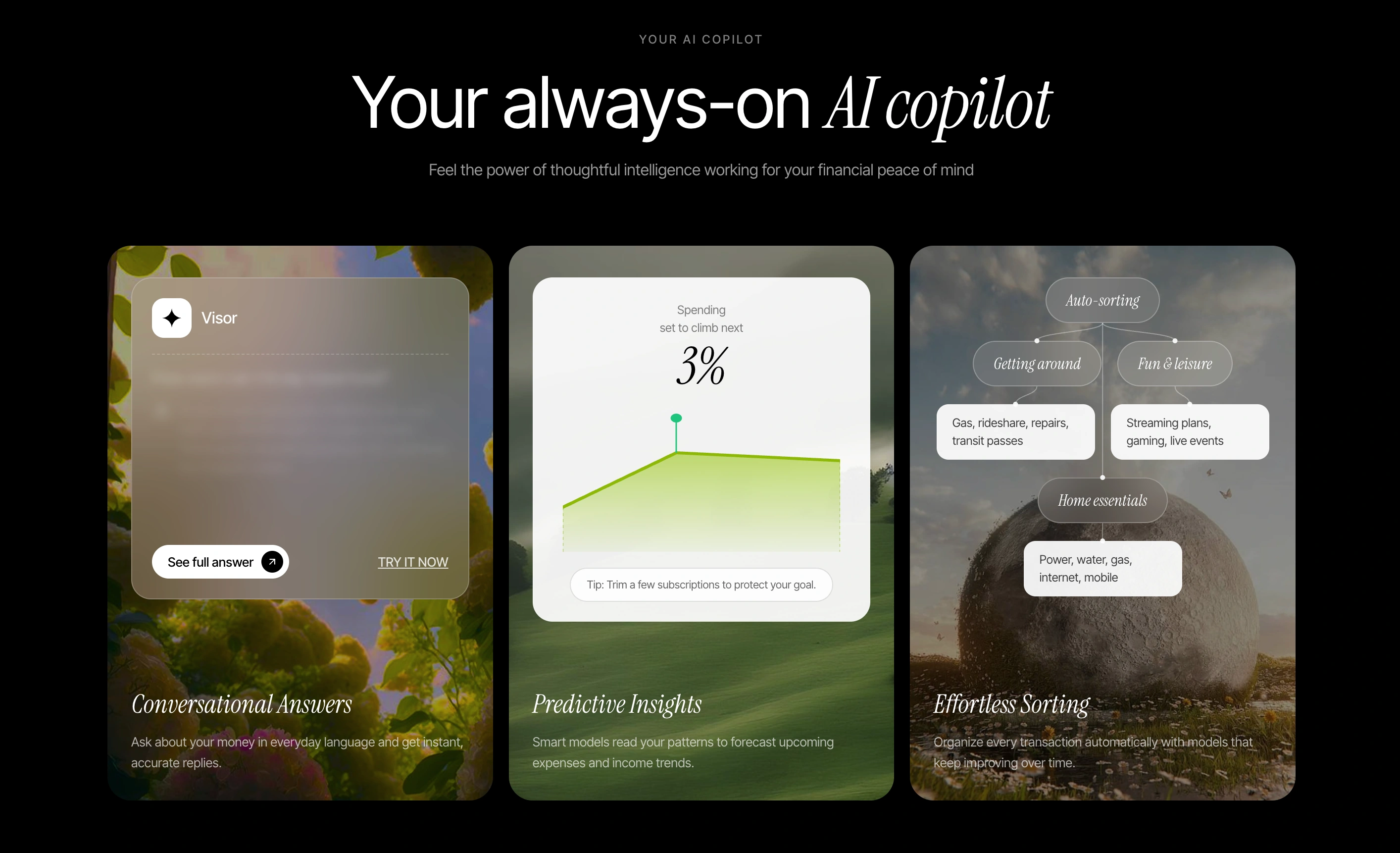
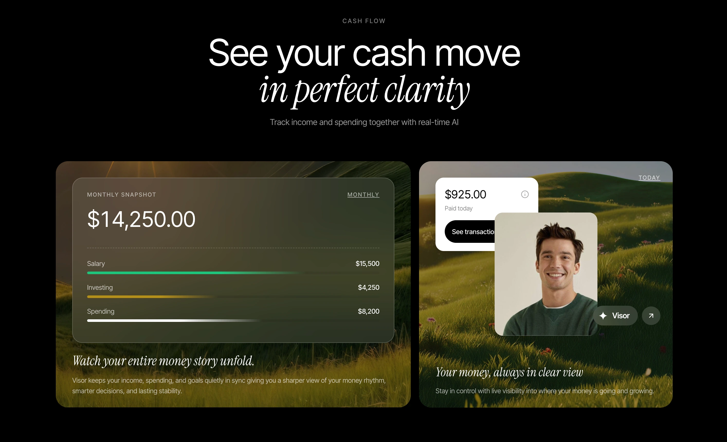
 Hero— An ambient video, a single tilting story card, a marquee of the names people trust.Cash flow— A glass overview panel with figures that resolve as you arrive — income, investing, and spending in one monthly view, with the balance counting up as you land on it.Your AI copilot— A rotating question-and-answer card, a predictive chart, an auto-sorting tree. Ask about your money in plain English and get a real answer back, plus a forecast that flags rising spend before it happens.Feature cards— Horizontal, alternating, one idea each.Footer— A warm, quiet sign-off with the wordmark as a whole horizon.
The rules that hold it together: one accent color, one serif for emphasis and never for body, glass over photography, and motion that only reveals — in-view fades, a count-up, one 3D card — never motion that demands. Kill list: no alarm red, no dashboard clutter in the hero, no stock-ticker urgency, no purple gradients, no mascot, no second accent.
The Impact
Shipped as a complete, production-quality front end: five composed sections plus footer, a self-hosted video hero, real component architecture, and choreographed reveal animations that hold together at speed. It reads as one system — every screen sounds like the same brand talking. A full hero-to-footer site built to a portfolio standard.
The Takeaway
Calmisthefeature.Trustisthebrand.